

 So, we did a thing recently...
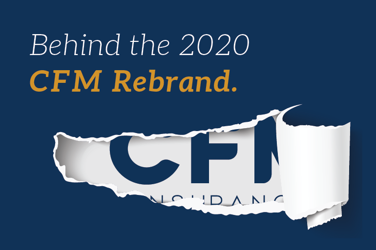
The CFM Marketing Team - comprised of [only] four in-house talented women - which you'll have the pleasure of meeting a little later on - took a 150-year-old mutual insurance brand, and gave it new life. Impressive, right? The really cool thing is it basically happened overnight.
Ok, kidding! This rebrand was hard work, guys - hard work that we're beyond proud of, hence the reason we're walking you through it all from start to finish in this blog. So, let's go on a trip, shall we? Let's talk about the 'why' and 'how' behind this year-long CFM rebranding project and dive deeper into what makes this such a monumental moment in our company's history. Spoiler alert - it was all inspired by you.
Why Rebrand? And More Importantly, Why Now?
Short answer: All of the stars perfectly aligned for it to happen - The timing was right. The team was right. The intention was right. Long Answer: Well, that's a little more complicated. Whew, here it goes.
CFM Insurance has been around since 1869 - that's a really long time - 151 years, now, to be exact. Over the years, our name has changed here and there, along with our logo, but the one thing that has always stayed the same is our founding mission, our admirable collection of core values. At the end of the day, we just want to help people - always have, always will. CFM has consistently maintained its status as a reliable, trustworthy company that steps in to lift up our neighbors when they experience a loss, without hesitation of getting our hands a little dirty.
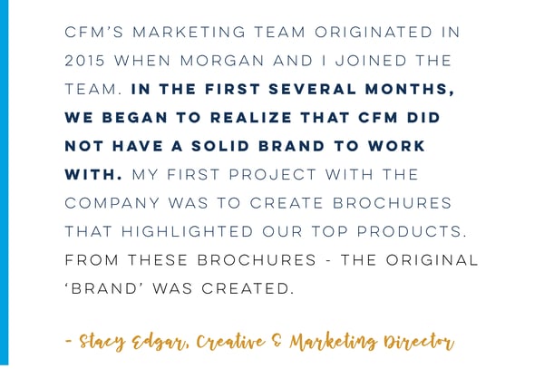
We wanted to capitalize on that genuinely good foundation by finally taking the time to back it with a brand that represented it to a T. See, before the internal Marketing Team was assembled (sounds like a line from The Avengers franchise, huh?), CFM really didn't have a brand or anyone in place to deliver one the company deserved. We had a logo. We had a name comprised of three letters. But we didn't have a true brand to tell our story in an attractive, compelling way.
 Let's talk about those three letters real quick - C.F.M. What do they mean? Arguably the number one question we regularly got from visitors at various statewide events was: "What does CFM stand for?" If you're thinking "Concordia Farmers Mutual", you're slightly mistaken. To all the steadfast CFM fans out there - sorry if that hurts a little, but we can explain.
When Concordia Farmers Mutual merged with Central Mutual out of Warrensburg, MO, in 2010, the two companies couldn't decide on a good name to move forward with. So, they just stuck with CFM because it was easy and familiar; it worked. But, essentially, it's an acronym with absolutely no meaning. That factor alone was a major reason we thought a rebrand was necessary. After all, it gave us the perfect opportunity to give meaning to CFM beyond just the letters, but also the entire messaging strategy - vision statement, mission statement, social media lingo - you name it. We were ready to make CFM's story come to life and stay relevant for another 150, anywhere and everywhere we could.
Another factor that played a significant role in this decision was the tree. Back when the merger took place, an outside marketing firm offered a logo with the state of Missouri situated behind a big tree, which was then used consistently for the next five years.
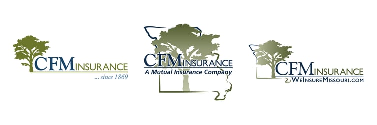
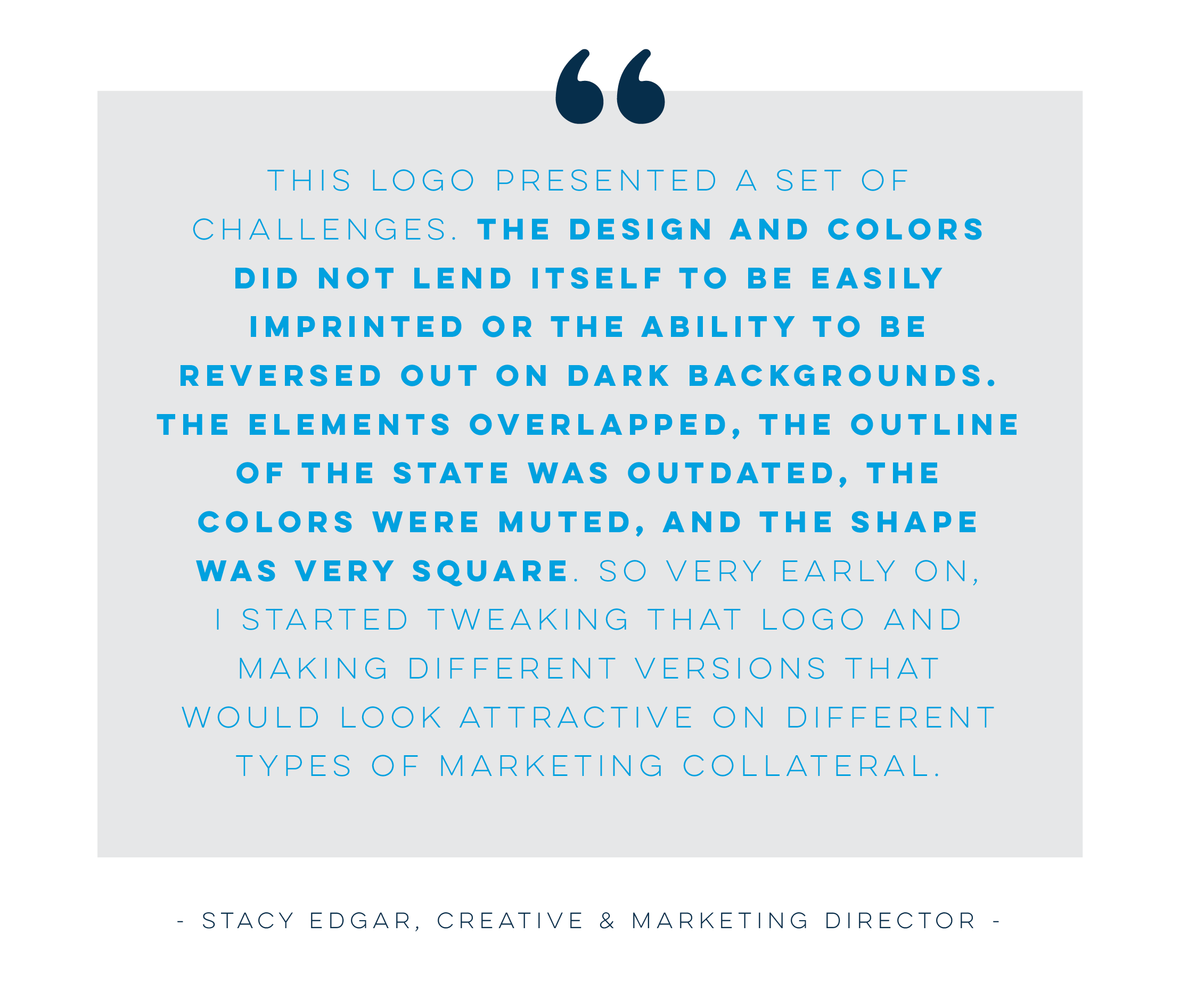 When discussing what an ideal new logo might look like, that picture didn't exactly include a tree. We get the symbolism behind the tree in our old logo - it represented our deep roots in this region, our strength. And what's more suggestive of strength than an old oak tree, after all? But by now, everyone knows how stable and reliable we are. We don't necessarily need a tree to tell that story anymore. Plus, from a design standpoint, our graphic artists - God bless 'em - just couldn't create a modern, timeless logo centered around a tree that everyone absolutely loved. When you can't fall head over heels in love with something - whether it be a person or a logo element in this case - you should probably just let it go.
The next 365 days would be spent promoting the monumental milestone CFM had reached - our 150th year in business. This 2019 anniversary event was so big, so grand, so noteworthy, it called for its own commemorative logo. So with the input of company veterans that knew CFM better than anyone, the team came up with a full-fledged CFM150 brand, complete with a traditional-meets-futuristic tagline and a much cleaner, contemporary logo.
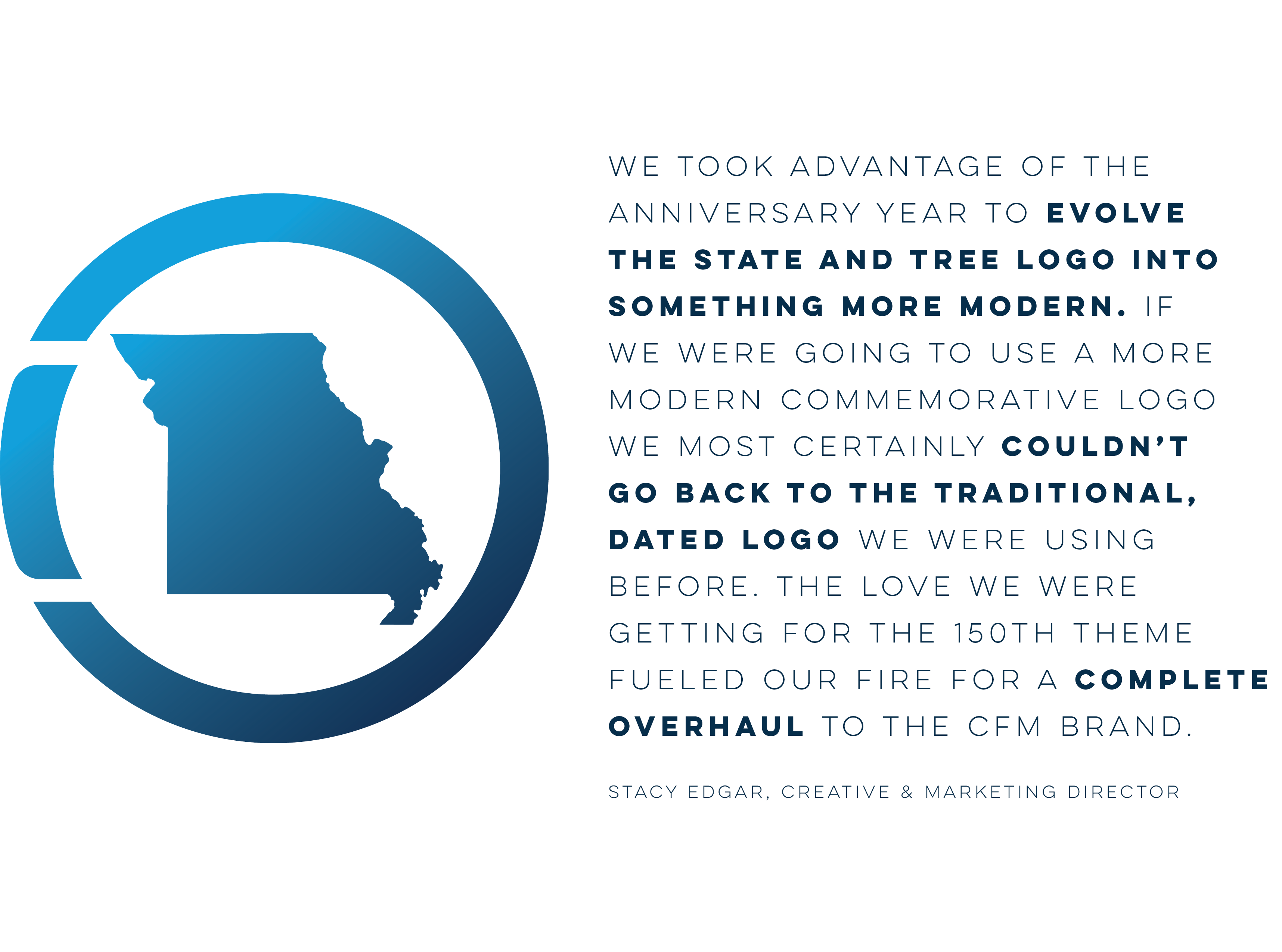
Remember that short answer version above that mentioned perfect timing? Well, this was it. What better time to move forward with a fresh, new CFM than after a considerable anniversary year? Out with the old, in with the new!
With the reality of a long-awaited rebrand now at the forefront of our 2020 strategy conversations, we knew if we were to move forward with something different, it had to be convincing enough that no one could reject it. The unanimous decision to officially bid our tree farewell and incorporate all the elements we loved about our 150 logo into a reimagined version, required us all to pull up a seat to the drawing board and take a hot minute to think about what this new logo would be comprised of. What does it look like? What does it stand for?
Enter Our Aha Moment!
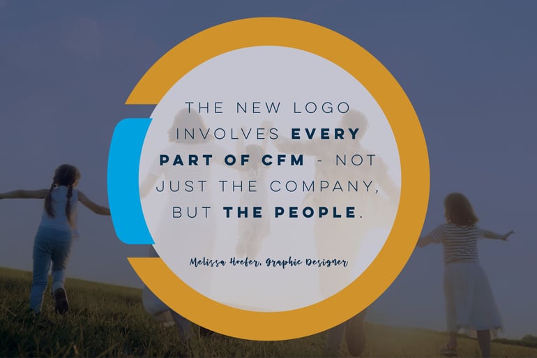
Because of the immense weight this decision held for the group, the "new and improved CFM" didn't come without a little (or a lot of) back and forth. However, we did find that maybe, just maybe, we were making this too hard. If you strip away all the neat design "stuff" in a brand, you're left with the heart of the company - as cheesy as that sounds. So we fully explored that notion and found that what makes CFM truly great and different in a very flooded market is...drum roll please...our people.
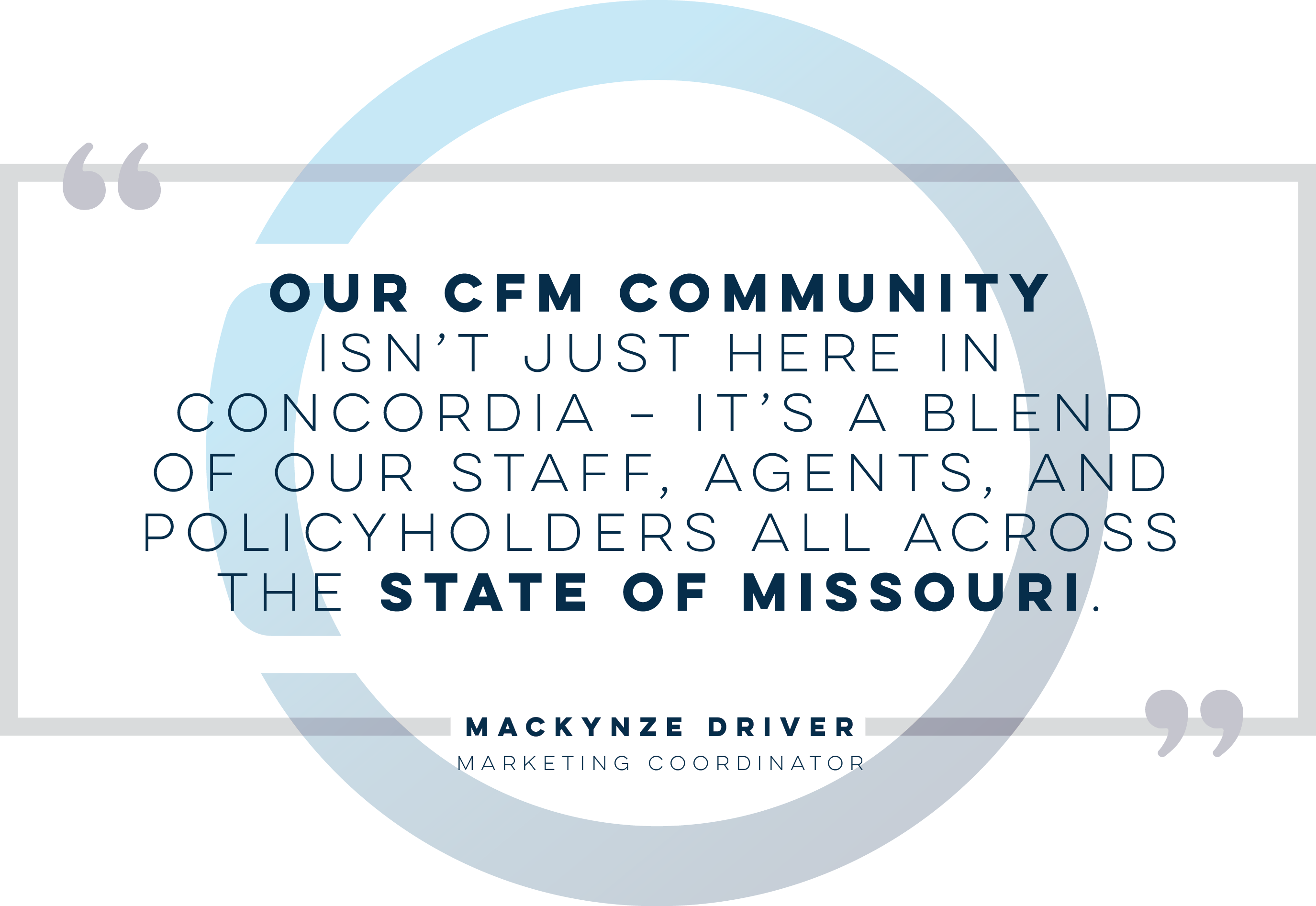 This we know for sure - we haven't earned the loyalty and trust of our customers through big, expensive Super Bowl ads or celebrity endorsements. CFM doesn't have a catchy jingle or tv commercials starring a talking animal mascot to make people remember us. They trust us and remember us because we show up. We show up at community fundraisers, fairs, and other events that need our support. We make a presence in the places we serve to build those authentic, lasting relationships with our people.
Our collective goal is to never stop advocating for Missouri communities because we want them to continue thriving beyond the present. Our future as an insurance company and Mutual, specifically, depends on those healthy communities. If we didn't have their support, our policyholder base wouldn't be nearly as strong as it is today. That's why CFM makes it a point to invest in our communities every chance we get because that's ultimately how the loyalty piece of our brand is developed. So, why not build this awesome new brand around our number one priority? Community betterment - community first.
With the Community First concept at the center of this new brand, what could the 'M' stand for? For years, we had always randomly said, "it's a mutual thing" when talking amongst ourselves about the factors that made Mutuals different than your traditional stock insurance companies. Heck, we even made it a hashtag on several of our social media posts throughout our 150th year.
If we loved this casual expression so much, why not incorporate it into our brand messaging, long term? Not only does it resonate with so many real-life experiences outside of insurance, but it also fits right in with the point we were so determined to drive home to our audience - At CFM, we put our communities first... It's a Mutual thing.
Introducing: The Full Circle Effect
The CFM Family is all-in on our new messaging for the years to come. We will continue to shower our Missouri communities with support whenever and however we can. But we'll need your help. Stay tuned for a launch announcement spotlighting a donation-driven feature on our updated website powered by our motivated and generous agent/policyholder force.
Now, what about that new logo?
Let's Talk Logo: Purposeful Design + Color Scheme
At first glance, you'll notice the new logo incorporates the same silhouette and colors of our CFM150 logo, with the addition of an accent blue and new, bolder typeface. That pop of bright blue is perhaps the most meaningful component of the logo because it represents the most important piece of our business, the policyholder. When you insure your property with CFM, you become a piece of our circle - our family. Keeping the gold from the 150 logo and navy blue from our older, tree logo allowed us to maintain just enough familiarity with the new design, while still presenting something fresh, purposeful, and different for the years to come.
 We also kept the state in the logo, cleaning up the outline just a bit, because it's always been our home and it's where we'll remain - We insure Missouri. The gold circular shape around the state represents both the company - as the protector of Missouri - and also the Full Circle Effect mentioned in our messaging. Every premium has a purpose at CFM - to continuously flow back into the Missouri communities we all call home. As a Missouri-exclusive Mutual, it's our promise to help each community in our state develop and progress like we have as a company throughout time.
But wait...there's more!
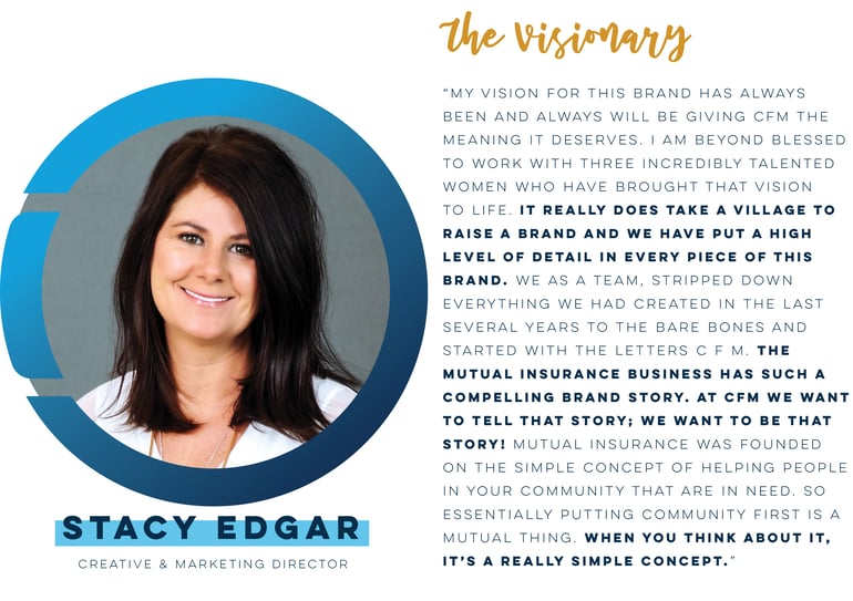
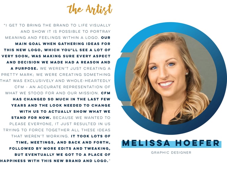
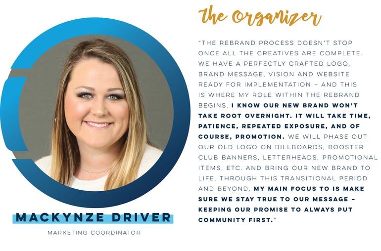
Meet The Marketing Dream Team
Oh, hey, it's me (look down, silly) - the author of this blog *virtual wave/awkward winking*. Little did you know, you've been listening to me ramble on this whole time. Well, congrats - you've made to the end...almost. Here's just a tad more reading material about my role in this process. Then, you're free to go. Speaking on behalf of everyone on the Team - thanks for listening.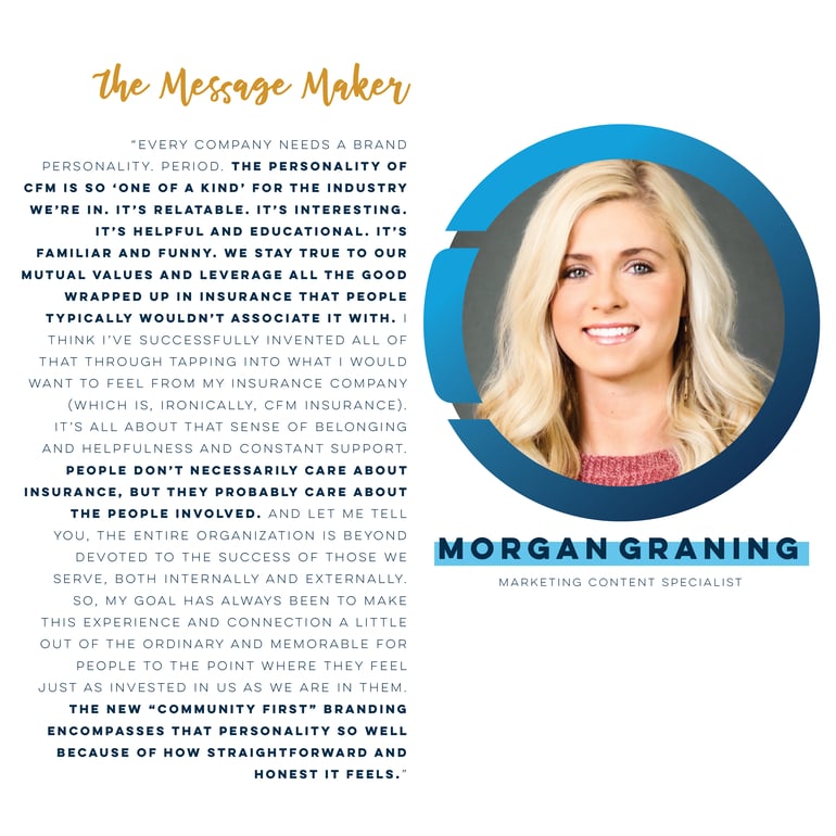

Your Comments :